
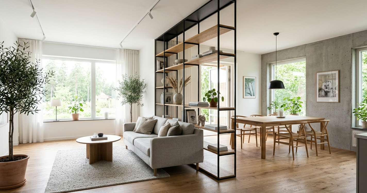

Solid walls block light and shrink a floor plan. Fully open layouts leave you with no acoustic privacy and every mess in every zone visible from everywhere else. A floor-to-ceiling open shelving unit — a “floating boundary” — is a middle path: it zones a space without fully closing it off. Here’s how to actually build one well, and why the effect works the way it does.
Why This Works: A Real Concept, Not Just a Trend
There’s a genuine explanation for why partially-open dividers tend to feel better than either extreme. Environmental psychologist Jay Appleton proposed “prospect-refuge theory” in 1975, and it remains a widely referenced framework in architecture and design research: humans tend to prefer spaces that offer both prospect (an open view out) and refuge (a sense of shelter or enclosure) at the same time. A solid wall gives you refuge with no prospect. A fully open room gives you prospect with no refuge. A permeable divider — something you can see and light through, but that still visually breaks up a space — offers a version of both simultaneously, which is part of why this approach tends to feel more comfortable than either extreme.
Building It: Structural Basics
This isn’t a furniture piece you can just set down — treat it as built-in architecture:
- Anchor floor-to-ceiling. The frame should tie into the subfloor and ceiling joists, not sit as a freestanding console. This is what makes it read as architecture rather than a bookcase.
- Use a slim structural frame. Architectural-grade steel uprights in a finish like oil-rubbed bronze, matte black, or champagne gold keep the frame visually light even though it’s structurally solid.
- Pair thin framing with substantial shelves. Thick shelf slabs — solid white oak, walnut, or a stone like travertine or dark marble — create a visual contrast against the slim metal frame. Avoid thin glass here; the weight-versus-lightness contrast is part of what makes the piece feel intentional rather than flimsy.
Styling It: Our Recommended Approach
There’s no universal rule here — this is a styling approach we’ve found works well, not an established design law:
- Leave meaningful negative space. A shelf packed edge-to-edge with objects reads as clutter, not curation. Leaving a significant portion of each shelf empty gives the pieces you do display room to actually be seen.
- Favor fewer, larger objects over many small ones. A handful of substantial pieces reads as intentional; a shelf full of small tchotchkes reads as accumulated rather than chosen.
- Route lighting into the shelves themselves. Since a freestanding divider doesn’t have wall outlets or ceiling fixtures built in, hidden dimmable LED strips under the shelf edges solve the lighting problem while adding depth at night.
- Add one or two trailing plants. Something like a pothos or philodendron in a simple planter on an upper shelf adds movement and softens the structure’s hard edges.
The Honest Trade-off
This is a real construction project, not a weekend DIY — proper structural anchoring into joists typically means involving someone who can confirm what’s actually load-bearing and where. It’s a bigger investment than a bookcase, but it’s also solving a different problem: zoning a space you don’t want to permanently wall off.
Bottom Line
The appeal of a floating open-shelf divider isn’t just aesthetic trend-chasing — it’s applying a genuinely studied principle about why humans respond well to spaces that offer both openness and shelter at once. Build it properly (real structural anchoring, a real weight contrast between frame and shelves), style it with restraint, and it solves a real problem that neither a solid wall nor a fully open plan does well.
Sources: Jay Appleton, “The Experience of Landscape” (1975), foundational work on prospect-refuge theory in environmental psychology and its ongoing application in architecture and design research.
