For years, the phrase “neutral color palette” evoked a highly predictable, almost monochromatic visual landscape. High-end residential interiors were strictly confined to a rotating spectrum of stark whites, cold grays, chalky beiges, and soft creams. While these shades provided a safe, clean backdrop for modern furniture, they often lacked a certain vital energy. They stripped spaces of character, creating homes that felt beautifully tailored but emotionally detached. The design world mistook a lack of color for sophistication.
In the summer of 2026, a major shift in green interior design has completely rewritten the rulebook. The design elite are officially rescuing green from the category of “bold accent color” and elevating it to its rightful place as a complex, grounding neutral.
When amateur decorating blogs try to tackle this trend, they tend to over-saturate the space. They suggest painting a loud forest green accent wall or buying a bright emerald velvet sofa. This heavy-handed approach destroys the quiet luxury aesthetic.
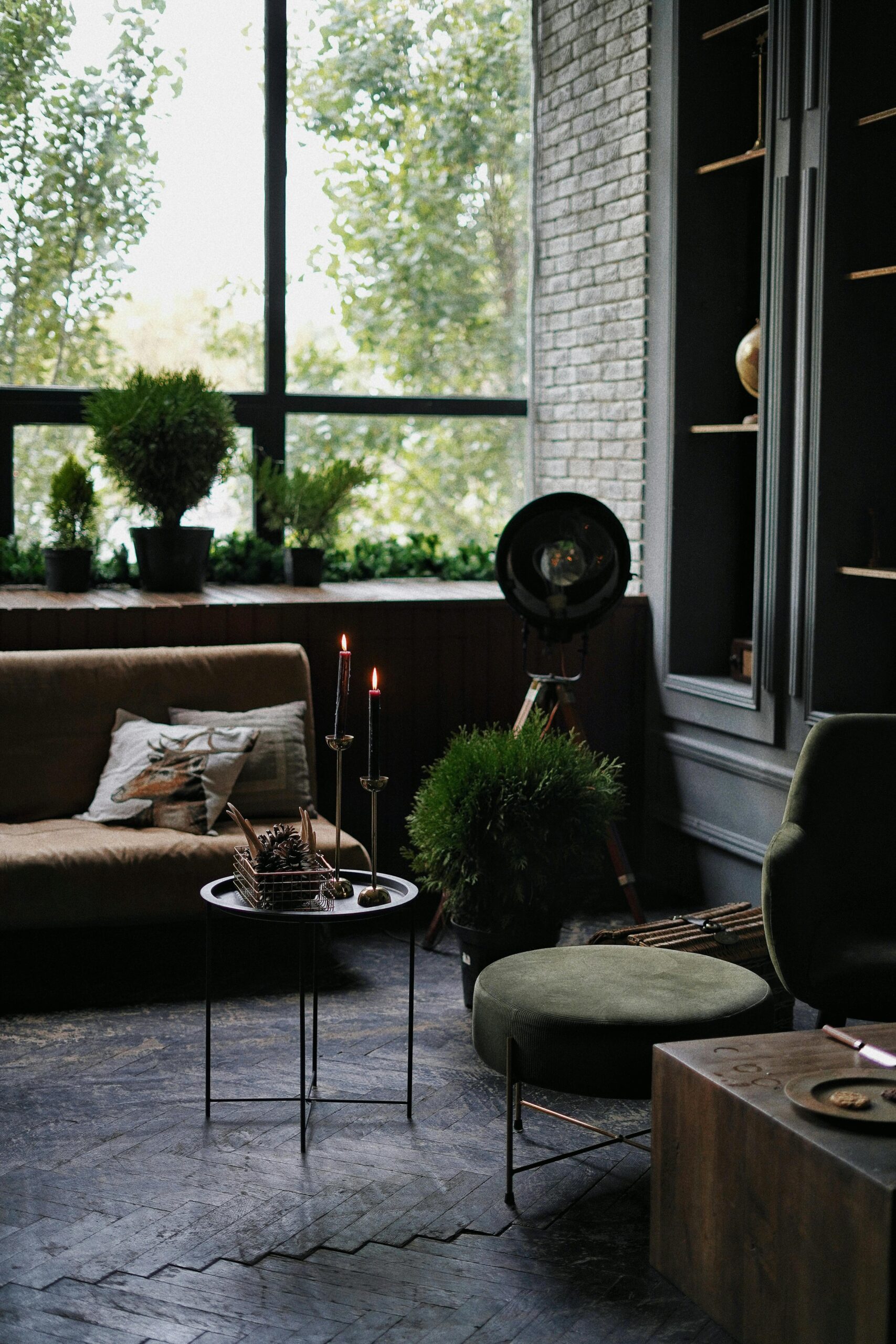
Authentic green interior design treats the hue with immense restraint, focusing on desaturated, mud-toned variants like olive, sage, lichen, and crushed moss. When these complex, silver- and brown-under-toned greens are utilized as a foundational canvas, they possess the unique architectural ability to recede into the background, functioning exactly like a traditional neutral while offering an undercurrent of rich, organic life. The ultimate way to unlock the depth of this palette is by pairing it with the hypnotic, high-contrast luxury of burl wood. Here is your masterclass in balancing these two powerful elements.
🎨 1. The Desaturated Palette: Selecting Your Green Foundation
The secret to using green as a true neutral lies entirely in its desaturation. If a green shade feels too clean, bright, or energetic, it will dominate the room, forcing the other materials into submission. You are not looking for the vibrant pop of a summer leaf; you are looking for the quiet, dusty tones of native flora.
When specifying wall finishes for a primary living pavilion or an executive study, bypass standard paint formulas. Opt for breathable lime-wash finishes or micro-cement overlays in muted olive, soft sage, or weathered khaki. These formulations feature heavy gray, brown, and ochre base pigments that adapt beautifully to changing light conditions. In the bright exposure of midday, they feel soft, airy, and expansive. Under evening lamplight, they deepen into an incredibly cozy, protective envelope. This subtle, shifting backdrop provides the perfect understated stage for high-end furniture placement.
🪵 2. The Burl Counterpoint: Introducing High-Voltage Grain Architecture
Burl wood is nature’s ultimate luxury sculpture. Formed from an abnormal growth on a tree trunk, burl possesses a dense, tightly clustered, swirling grain pattern that resembles a highly detailed topological map or an abstract fluid painting. Because its visual patterns are so incredibly complex and dynamic, burl wood requires a calm, visually quiet environment to avoid looking chaotic or dated.
This is why desaturated green interior design acts as the perfect structural partner for burl. The quiet, monochromatic calm of an olive or sage backdrop instantly settles the frantic energy of the wood grain. Introduce burl through highly intentional, clean-lined architectural silhouettes: a magnificent Mappa burl waterfall coffee table, a sleek olive-ash burl credenza with book-matched door panels, or a floating entryway console carved from burl walnut. Placed against a dusty green wall, the golden-honey tones and dark, clustered eyes of the wood pop with a dramatic, three-dimensional depth, transforming a simple piece of furniture into an undeniable architectural focal point.
📐 3. Tactile Balance: Velvet, Linen, and Raw Timber Juxtaposition
A space built around green neutrals and intricate wood grain must rely heavily on a rich tapestry of textures to feel complete. If the surrounding fabrics are too flat or synthetic, the connection to the natural world is broken, and the design loses its organic authenticity.
To anchor your seating arrangements, choose fabrics that offer significant physical weight and tactile variation. Pair an oiled burl wood side table with a low-slung lounge chair wrapped in deeply textured, moss-green bouclé or an oversized sofa upholstered in a heavy, slubby Belgian linen the color of dried sage. Introduce subtle structural contrast by layering a smooth, matte olive-drab mohair accent pillow over the rougher linen surfaces. This deliberate orchestration of varied pile heights and raw material states echoes the natural complexity of a forest floor, wrapping the inhabitants in a sense of deep tactile comfort.
🗿 4. Earth and Iron: Incorporating Grounding Hardware and Stone
When executing a green-and-burl design scheme, the supporting architectural details must echo the organic, unpolished luxury of the primary materials. Introducing bright chrome or polished, synthetic white surfaces into this environment creates a harsh, artificial disconnect.
Look to the geological spectrum to ground the room’s perimeter. Introduce a low-profile fireplace surround or a low cocktail table crafted from a deeply characterful stone like honed Verde Alpi marble, soft soapstone, or a creamy travertine with deep, unfilled fissures. For hardware, plumbing fixtures, and metal frames, lean heavily into dark, industrial elements that contrast the warm glow of the burl wood. Specify blackened iron, oil-rubbed bronze, or hand-forged patinated steel. These matte, dark finishes cut cleanly through the soft green tones, adding structural definition and a sense of architectural permanence to the fluid lines of the space.
🕯️ 5. Cinematic Lighting: Highlighting the Micro-Details of the Grain
Because burl wood features thousands of tiny swirl patterns and subtle mineral variations, its beauty can easily be flattened and lost under uniform, low-contrast ambient lighting. The space requires a highly strategic lighting plan that acts like a gallery spotlight.
Completely bypass central, high-output ceiling fixtures that flood the room from above. Instead, implement a low-profile layered lighting scheme that rakes light across the surfaces at an angle. Position a sleek, matte black articulating floor lamp directly next to your burl credenza, directing a narrow beam of warm (2700K) light down across the book-matched wood veneers. This directional illumination accentuates the natural sheen of the grain, casting tiny, delicate shadows within the burl’s intricate swirls and creating an incredible illusion of movement and luxury as you walk past.
💡 The Organic Synthesis: My Final Styling Note
The ultimate triumph of green interior design paired with luxury burl wood is its ability to feel simultaneously historic and deeply modern. It steps completely outside the exhausting cycle of fast-moving design trends by anchoring itself in the timeless, un-hurried language of nature. When you step into a room grounded by dusty olive walls, cradled by tactile linens, and punctuated by the fiery, swirling soul of a burl wood centerpiece, your perspective slows down. You have escaped the cold, clinical tech-driven world and returned to a space that feels deeply human, permanent, and masterfully composed.
